Nanoleaf’s 4D TV-syncing strip lights are a first for the brand, which is known best for making some of the best smart lights available. With Nanoleaf 4D, the brand has easily accomplished one of the best Ambilight alternatives and created some serious competition for established brands in the space such as Philips Hue and Govee.
The set is available in two sizes, one for screens up to 65 inches and the other for models up to 85 inches, and come in at a fairly affordable price of $99 / £89 / AU$189 and $119 / £119 / AU$229 respectively.
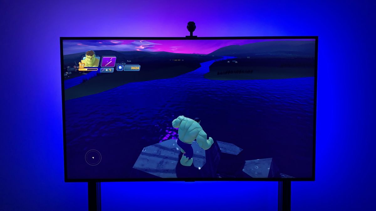
Out of the box, the Nanoleaf 4D kit consists of an LED light strip that is attached to the back of the screen and plugged into a control box, which in turn connects to a camera that detects the colors displayed on the screen. The kit illuminates the LEDs to match the picture on your screen, throwing the colors onto the wall behind the screen for a pleasing synchronized glow around the screen.
The camera can either be mounted atop the TV with the included armature, or placed on your TV table using its built-in stand, and those concerned about prying digital eyes around their home will be pleased to learn that the camera also comes with a magnetic privacy cover.
One of the slight niggles I found when setting up the lights concerned how the cables that connect the lights and camera to the controls are positioned. The rather vague instructions in the handbook encourage you to begin your light strip placement in the bottom right-hand corner of your screen, meaning the wire for the lights trails from that corner, while the camera cable falls centrally.
This leaves you with a choice of either bending and sticking the light strip wire or having the control sit somewhere near the right-hand side of your screen, lest you run out of wire length to play with. All in all, although not a major issue, I value a neat home entertainment setup and this doesn’t necessarily facilitate that.
Installation is otherwise very straightforward, although you will need to remove your television from the wall to fit the lightstrip, and potentially need a second pair of hands if you’re a real perfectionist. I cheated as my test screen is on a stand! The kit comes supplied with corner mounting blocks which allow the strip to curve around the corners (rather than creating a loop out of the strip which would create problems in accurately matching the colours to the screen.)
There are 10 color zones per meter and 30 LEDs per meter, and the strip can be cut to length at specific 10-centimetre intervals. This does mean you might end up with a gap or excess of the strip when they meet at the end, but a little trial and error with placement before sticking anything on will minimize this.
Once that’s done, simply peel off the tape backing and stick that strip down, and you’re all set. The strip does tend to peel away from the back of the screen where the two ends meet, but that’s easily resolved by applying some more double-sided sticky tape.
The Nanoleaf app is nicely laid out and works well most of the time, but can occasionally crash. Whilst I appreciate that all software has bugs, some sort of an error message would be nice. Having said that, the things that you can do with this software and the kit impressed me; the Nanoleaf 4D does all of the usual colored lighting tricks that LED strips do. But let’s face it, screen synchronization is what we’re here for.
The app guides you through mapping out your TV lights, and once you’re set up, you can create your own scenes, or you can use the Magic Scenes feature to create a palette based on a mood or keywords (although I found that the latter favored washed-out hues).
You can choose between four settings (or dimensions, between 1D and 4D), which range from an ambient white glow to the aforementioned screen-matching lights akin to the gold standard Ambilight-style experience. It’s a little tricky to find clear guidance on what each of the dimensions does, so here is my take on it.
1D: White light that’s well suited to documentaries and general viewing
2D: Block color that’s great for ambiance, representing an average of the color displayed on-screen
3D: Splashes of color reflective of on-screen action, but not extending the screen
4D: Colors extend from the edges of the screen for full immersion
You can change the color settings by cycling through the controls or via the app.
Nanoleaf 4D features the same sound-reactive functionality boasted by its smart light siblings, and as a bonus, responds to sound far better than the Nanoleaf Smart Holiday String Lights I reviewed last month.
Once I had finished playing with all of the settings I played a few games and films and noticed that one side of the screen was not displaying the screen colors correctly. Further investigation revealed the problem; I needed to close a white door that was being reflected on the screen. You have a choice: either be mindful of the lighting and reflective objects in the room or spend between 4 or 5 times as much on a Philips Hue system for its HDMI linking.
Image 1 of 8
The only feature I found myself missing is a perennial issue for non-HDMI smart screen lights – automatic screen detection. Call me lazy, but I’d prefer my lights to come on when they detect on-screen activity, rather than requiring me to use the app or physical control.
Overall, I’d say the Nanoleaf 4D screen mirror and lightstrip kit is a great low-cost alternative to the Philips Hue system that just edges out the other low-cost alternatives in several areas; it’s easy to install, well-designed and the results can be spectacular. This thing is so versatile and colorful that it made me want to get some Nanoleaf wall tiles to test their claim of the 4D’s ability to “extend the screen sync effects across 50+ Nanoleaf RGB lights”. Look, somebody’s got to do it…
Nanoleaf 4D screen mirror and lightstrip kit: price and availability
List price:
TVs & monitors up to 65-inch: $99 /£89.99 / AU$189.99
TVs & monitors up to 85-inch: $119 /£119.99 / AU$229.99
Camera only kit: $79.99 /£69.99 / AU$149.99
The Nanoleaf 4D screen mirror and lightstrip Kit are available directly from the Nanoleaf website, starting at $79.99 / $69.99 / AU$149.99 for the camera-only kit. You can also buy the camera-only kit from Amazon in the UK but curiously, not the full kit – however in the US, you can buy all three packages on Amazon.
The camera-only kit is a great cost-effective option which can be used with the Nanoleaf RGB LED light strip or any RGB light strip that has USB-C connection.
Value-wise, the Nanoleaf 4D is undoubtedly one of the best, if not the best value smart TV lights – the Philips Hue alternative for 75-inch and over TVs is nearly $100 / £100 / AU$300 more expensive at $249.99 / £209.99 / AU$509.95, and you’ll need a Philips Hu bridge if you don’t already have one. Govee’s lights sit squarely in between but don’t offer such consistency or smooth light performance as Nanoleaf.
Nanoleaf 4D screen mirror and lightstrip kit review: Specs
Control via the Nanoleaf App (Android & iOS) for mobile/tablet or the Nanoleaf Desktop App (Windows & Mac).
Bluetooth, Smart App
Hue Sync Box
Compatibility
Apple Home, Amazon Alexa, Google Home, IFTTT, SmartThings, Razer Chroma
Alexa, Google Home
Alexa, Google Assistant and Apple HomeKit
Colors
16+ million
Unknown
16+ million
Nanoleaf 4D screen mirror and lightstrip kit review: How I tested
I installed the Nanoleaf application and added the Nanoleaf 4D screen mirror and lightstrip Kit to Apple HomeKit
I tested all of the modes and scenes against different types of content (i.e. films, TV programs, Games) and resolutions
I tested each claimed feature e.g. “Reacts to music” where possible
I tested the kit under various lighting conditions.
I had already tested a pre-release version of this kit last year which was unfortunately defective and a very frustrating experience. The days that I spent trying to get it to work reliably were not wasted though as it gave me a good understanding of how the thing works and how it has been improved.
I was pleased to be able to make use of scenes in Apple Homekit which I could not get to work when I tested the Nanoleaf Smart Holiday String Lights last month. I switched off Bluetooth on my phone and ran all of the tests again to find out if there was any function that used Bluetooth and everything behaved normally.
The room I use to test things is the worst-case scenario for the Nanoleaf 4D screen mirror and lightstrip Kit as it is almost completely white. Everything gets reflected on the screen, especially in daylight which affects the colors that the camera detects. I was pleasantly surprised during testing to find that some of the reflection problems could be dialed out using a custom vibrancy set which allows you to change the values for Dynamic range, saturation, and white balance.
Journalist for 25 years with leading publications in India and UAE such as The National, Mumbai Mirror, DNA, Indian Express and former Sports Editor of eIndia.com. Now managing editor of Headline.ae, part of MEMc (https://www.memc.co)
Chinese smartphone company Vivo has made its latest attempt to make a name for itself outside China with its new premium phone, which takes on the Samsung Galaxy S24 Ultra and iPhone 15 Pro Max as a top-price top-spec juggernaut.
The Vivo X100 Pro is the brand’s most recent top-end Android phone, following the Vivo X80 Pro from 2022 – the company has a bit of a scattergun approach when it comes to releasing its Chinese phones in the rest of the world.
The X80 Pro was a great phone hindered by a horribly high price tag; while the Vivo X100 Pro is also an eye-wateringly pricey smartphone, it does a much better job at justifying this cost than its predecessor. It’s still unlikely to tempt you from Samsung or Apple’s latest powerhouses, but you won’t feel disappointed by it either.
The most startling upgrade the Vivo X100 Pro has, not just over its predecessor but over the vast majority of other Chinese mobiles on the market, is in the software department. Not only is it a bloatware-free breath of fresh air, but it’s good-looking, with lots of customization and navigation tools that are easy to use and improve your phone experience.
Vivo’s also greatly improved its cameras on the X100 Pro. It boasts three 50MP snappers on the back: a main, ultra-wide and telephoto combo. Pictures are bright and bold, but the camera app also offers an eye-watering number of extra features, tools and functions.
Want to zoom between 0.6x and 100x? Add different color profiles to your photo? Take a picture of the stars and have the phone use augmented reality to work out what constellations you’re actually looking at? The camera app can offer all of those.
This is also as powerful a phone as you’d hope for its price. The chipset is ready to blaze through your choice- game, photo editing app or AR simulation. The screen looks great, with a high resolution and refresh rate. You’re getting oodles of RAM, a huge amount of storage and a really long battery life.
An extra feature lets you use the Vivo as a portable power bank for other gadgets, with reverse wireless charging, which proved very handy when headphones or tablets were running out of power.
The X100 Pro isn’t the perfect phone for everybody: it’s huge, so people with small hands might struggle, with a giant camera bump that means it doesn’t sit flat on surfaces, and sadly no 3.5mm headphone jack. But its biggest issue is still the price, which is hard to swallow no matter how many top-end features you’re getting.
Vivo X100 Pro review: price and availability
Unveiled in January 2024
On sale in Europe, Asia; not the UK, US or Australia yet
Costs €1,199 (around $1,300 / £1,020 / AU$1,990 )
The Vivo X100 Pro was unveiled in late January 2024, and saw a slow roll-out across Europe and India over the following months. Based on precedent, we don’t expect a US release for the phone, as Vivo generally doesn’t sell its tech on that side of the pond.
At the time of writing, no UK price has been confirmed, but in Europe it costs €1,199, which converts to roughly $1,300 / £1,020 / AU$1,990 for the 16GB RAM and 512GB storage model. This is a premium phone for people who want top specs.
Some other variants are on sale in China, but Vivo seems to be pushing the 16GB/512GB model as the primary model in Europe.
Vivo X100 Pro review: specs
The Vivo X100 Pro is a top-end phone, and its specs prove it:
Swipe to scroll horizontally
Vivo X100 Pro specs
Header Cell – Column 1
Dimensions:
164.1 x 75.3 x 8.9mm
Weight:
221g
Screen:
6.78-inch 20:9 HD (2800×1260) 120Hz AMOLED
Chipset:
Mediatek Dimensity 9300
RAM:
16GB
Storage:
512GB
OS:
Android 14 w/ Funtouch 14
Primary camera:
50MP, f/1.8
Zoom camera:
50MP f/2.5, 4.3x optical & 100x digital zoom
Ultra-wide camera
50MP f/2.0 119-degree
Front camera:
32MP f/2.0
Audio:
Stereo speakers
Battery:
5,400mAh
Charging:
100W wired, 50W wireless
Colors:
Startrail Blue, Asteroid Black, Sunset Orange
Vivo X100 Pro review: design
Very large, with a giant camera bump
USB-C port but no 3.5mm headphone jack
In-box case is very sturdy
There’s no two ways about it: the Vivo X100 Pro is a big phone, and you’ll feel its heft in your hand. Measuring 164 x 75 x 8.9mm and weighing 221g, this thing will fill up your pocket and require a large mitts to be able to hold it in one hand.
The phone has slightly curved display display edges, which it makes it feel a little more comfortable to hold but doesn’t taper so dramatically that you’re at risk of accidentally pressing it. Not once during testing did I encounter the dreaded accidental-curved-edge-button-press.
Dominating the back of the mobile its its large camera bump; a protruding circle housing the three lenses and the flash module. This sticks out enough that you’ve no hope of putting the phone flag on a table.
Normally, for a phone like the Vivo X100 Pro, I’d recommend a case: not only will it make the large phone a bit grippier, but with a glass front and back, the device isn’t too protected from drops and bumps otherwise. However, the box contains a fairly solid rubber one, that’s more durable (and nicer-looking) than most cheap in-box silicon ones. The phone also has IP68 protection, keeping it safe from accidental drops in bathtubs or fine particles.
On the right edge of the device – a slight stretch up, unless you’ve got big hands – is the power button and volume rocker. I resigned myself to relying on my non-phone-holding hand to change volume.
There’s a USB-C port for charging on the bottom edge of the phone but, as is the case in most top-end devices, no 3.5mm headphone jack. You’ll have to rely on Bluetooth or a USB-C adaptor for listening to music.
The Vivo X100 Pro is available in three colors: Startrail Blue, Sunset Orange and Asteroid Black, and as you can tell from the images, we used the latter. The exact availability might depend on your region, though.
Vivo X100 Pro review: display
Giant 6.78-inch display, which curves at edges
High-res 1260 x 2800 makes screen look crisp
Really high max brightness
The Vivo X100 Pro’s screen clocks in at a large 6.78 inches diagonally, an oft-used display size that’s commonly seen on big phones. This large size is why the phone is such a strain on the hand!
The resolution of the screen is 1260 x 2800, so you’re getting more pixels than on your standard 1080p phone, which is useful for certain games and streaming services that support higher resolutions. The refresh rate is 120Hz, so motion looks smoother whether you’re in a game or just swiping between menus.
A real stand out of the Vivo’s screen is its brightness – with a maximum output of 3,000 nits, it can get blindingly bright if you need it to. Bear in mind that many mobiles peak at below 1,000 nits, and most don’t go above 2,000 – so this is a lovely and bright display.
Vivo X100 Pro review: software
Android 14 with Funtouch 14 over the top
No pre-installed bloatware
Plenty of customization and navigation options
When you boot up the VIvo X100 Pro, it runs Android 14 with Vivo’s Funtouch 14 laid over the top.
Android 14 is, at the time of writing, Google’s most recent build of its mobile operating system, but Vivo has promised that the X100 Pro will see three years of updates. Some people may consider that on the low side, with other Android brands promising five or more years, but for the majority of people who don’t fastidiously follow tech news, three years will be adequate.
More so than most Android forks, Funtouch looks very similar to stock Android. Icons and wallpapers are bright and bold, apps appear on the main home page as small circles, and Google’s own apps form the backbone of the pre-installed list.
Talking of pre-installed apps, purchases of Chinese smartphones will know the problems they usually have with bloatware. Vivo bucks this trend with the X100 Pro – it didn’t have a single bloatware app, and in that regard it beats out even Google’s Pixel phones. Apple and Samsung need to take note with their app-infested software.
Funtouch has some customization: you can modify the always-on display, animations for things like fingerprint recognition, charging and home screen transitions, lighting effects for when the display is off but you’re listening to music, and ways to change app and UI design. There’s a lot of tweaking you can do if you’re so inclined.
Plus, lots of other useful features show up: there’s a smart sidebar for quick navigation, shortcuts that let you summon the camera app or turn off the camera by holding or double-tapping the volume down button, schedulable power on/off and other tasks and lots of digital wellbeing tools too. Funtouch is really feature-flush and I’d recommend you make your way through all the menus when you first boot up the phone.
Vivo X100 Pro review: cameras
50MP main, 50MP ultra-wide and 50MP telephoto cameras
32MP selfie camera on front
Loads of modes and options for photos and video
You could call the Vivo X100 Pro a triple threat, as it boasts three 50MP cameras across the rear array for photography. A main camera with optical image stabilization and laser autofocus is joined by a periscope zoom snapper with 4.3x optical zoom, and also an ultra-wide snapper with a 119-degree lens.
While camera performance was one of our problem areas in the X80 Pro, that’s fixed in the X100 Pro. This is a capable smartphone for photography, and while it doesn’t quite compare with the Samsung Galaxy S24 Ultra, it comes close.
Pictures taken on the main camera are sharp, rich in color and pick up details in low-light conditions well. Vivo’s AI clearly does a good job at optimizing scenes based on setting, even when pictures are taken in dingy locations.
Move over to the other cameras, pictures taken on the ultra-wide are noticeably lighter, but also a little more washed-out. This was only an issue when comparing pictures taken of the same scene between cameras, and sometimes it made for better pictures.
The 4.3x zoom camera was a treat to play around with, letting you close the distance with far-away subjects or add some natural depth to nearer objects, animals and plants. If you’re happy to use digital zoom (or cropping) you can get all the way to 100x, which is grainy but fun to try out. Up to 10x digital zoom, pictures were usable, but I’d advise against going any further.
Something that hit me when testing out the camera app, was the sheer number of extra features available. You can change between three color profiles, try different modes like Night, Portrait and Snapshot, add a tilt-shift effect, correct perspectives, turn on not one but twodifferent astrophotography modes, turn on a macro effect, and then go to down in the Gallery app editing it all.
Frankly, it’s a little overwhelming to begin with, but if you take time to go through all the menus you’ll find some really cool features. I particularly like the Astro mode, which uses AR to identify stars in your picture.
Shooting videos, you can record in 8K at 30 frames per second or 4K at 60fps, with slow-mo letting you drop down to 240fps at 1080p.
For selfies, you’re looking at a 32MP snapper. Pictures look a little dim compared to ones taken on the main camera, but Portrait mode uses AI to add some vibrancy as well as a realistic-looking bokeh blur.
Vivo X100 Pro camera samples
Image 1 of 7
Vivo X100 Pro: performance and audio
Dimensity 9300 is blazing fast
512GB storage and 16GB RAM
Bluetooth 5.4 but no 3.5mm headphone jack
A quick look at the Vivo X100 Pro’s specs list – or a brief gaming stint – tells you that this is a powerful phone.
The handset packs the same Dimensity 9300 chipset, which we’ve also seen in the Oppo Find X7, and it’s a champ for gaming. That’s paired with 16GB RAM and 512GB storage: plenty of space and lots of power. There’s no expandable storage but with how much comes on board, that’s not the end of the world.
In some regions, the VIvo X100 Pro has variants with either 12GB or 16GB RAM and 256GB, 512GB or a 1TB of storage, depending on which model you opt for or is available to you. In Europe, these aren’t on sale.
In a Geekbench 6 benchmarking test, the phone hit a multi-core score of 7,292 – that blazes past the Samsung Galaxy S23 Ultra in Geekbench’s official rankings (which is maxed at 5,244, with the Galaxy S24 Ultra not listed at the time of writing). This is all to say, it’s a very powerful phone.
I spent ages playing Call of Duty: Mobile and tested several other games like Northgard, PUBG Mobile and Ronin. Not a single game displayed any cases of lagging, with high frame rates and top graphic options available all around.
For those who don’t game much, this huge amount of power also benefits things like video and photo editing and simply having many apps open at once to jump between.
In terms of audio, there’s no 3.5mm headphone jack as mentioned before. You can use the Bluetooth 5.4 standard to connect, which is nice and reliable, or play music out loud. The dual speakers are fine for playing games or voice messages but if you want great audio for streaming music or movies, I’d recommend buying the best wireless headphones.
Vivo X100 Pro review: battery life
Giant 5,400mAh battery
Charges wired at 100W, wireless at 50W
Reverse wired charging is a useful extra feature
The Vivo X100 Pro has a 5,400mAh battery, which is one of the biggest power packs we’ve seen on a smartphone, with 5,000mAh the biggest generally used.
It’s needed too; between the large 120Hz display, 5G connectivity, and powerful chipset, the Vivo burns through power. Thankfully, because of the large chipset, the handset can comfortably get through a day of use without needing a recharge.
When you do need to power up the phone, it’s a quick affair: wired charging is a steamy 100W, which will see your phone go from empty to full in under half an hour if you have a compatible cable. Wireless charging is 50W, which is again incredibly fast for this mode of transmission.
There’s also reverse wired charging, so you can plug in another device to the Vivo and use it as a power bank – I found this handy for headphones when on the go, as it’s more reliable (and much faster) than reverse wireless charging. You just need to have a cable that’s USB-C to whatever your second gadget requires.
Should you buy the Vivo X100 Pro?
Swipe to scroll horizontally
Vivo X100 Pro score card
Attributes
Notes
Rating
Value
This is a pricey phone, though you get what you pay for.
3 / 5
Design
The X100 Pro is giant, with some obtrusive design features.
3.5 / 5
Display
A high resolution, a high refresh rate, and a really high max brightness.
4 / 5
Software
Vivo’s Funtouch brings loads of great features and no annoying bloatware.
4 / 5
Camera
A feature-heavy camera app wins points for the Vivo.
3.5 / 5
Performance
Top-tier specs make this phone blazingly fast, with plenty of storage too.
4 / 5
Battery
One of the biggest batteries on a smartphone with great charging features too.
4 / 5
Buy it if…
Don’t buy it if…
Vivo X100 Pro review: Also consider
If you’re shopping around at the top end of the smartphone market, you have a few options for rivals to the Vivo X100 Pro:
I tested the Vivo X100 Pro with 512GB storage and 16GB RAM, which seems to be the only model in my region. It was the black version of the device.
My test period for the Vivo X100 Pro was over three weeks, and that doesn’t even count testing that was being done during the writing process, which would push the full figure to roughly a month. Testing included videography, using various apps and functions, gaming, streaming movies and music and photography. For the latter, I ended up using the Vivo to take review units for other products I reviewed for TechRadar.
I was a writer and editor for TechRadar’s phone team for several years so I’ve got plenty of experience testing mobiles like this, particularly looking at Chinese mobiles – I’ve used devices from almost every major brand, including Vivo. I still review phones for TechRadar, as well as products in other categories.
The Motorola Razr knocked my socks off when I first saw it last year, and it’s remained one of my top three phone designs of the past year (the other two being OnePlus phones). I love the color options, I dig the feel of the ‘vegan leather’ finish, and I show off the amazing clamshell design. If you haven’t seen this phone go from a truly huge smartphone to a tiny, pocketable communicator, you need to get your hands on one for a look.
Compared to the Motorola Razr Plus, I missed the larger display but the smaller screen on the cover of the Motorola Razr was still sharp and very usable. You can get a preview of your selfies and videos on this phone, just like on the more expensive clamshell foldables, which means you can use the main camera as your selfie cam.
Unfortunately, the camera is the perennial compromise with foldable phones, and none moreso than on this Razr. The Razr Plus had disappointing cameras, but the Moto Razr cameras just feel a bit cheap compared to other options in this price range. For $500, you can get a Google Pixel 7 or a OnePlus 12R, and both of those have much, much better cameras than this phone.
What those phones, and any other phone in this price lacks is the cool factor of the Razr. You can snap it shut to hang up on a phone call. Heck, you can hang up on TikTok or Snapchat the same way. It’s a very satisfying way to put your phone away and focus what’s in front of you, and that is part of what makes the Razr so cool.
The Motorola Razr dares you to put away your phone. You can take photos without the distraction of a big screen. You can check messages with a quick glance. You can snap it shut and show off the look instead of looking at the show. That’s cool. Being hundreds cheaper than other clamshell phones? Maybe the coolest part of all.
Motorola Razr 2023 review: price & availability
Launched at a higher price and immediately went on sale
Cheaper than every other new clamshell
Don’t buy it when it’s not on sale
Swipe to scroll horizontally
Storage
US Price
UK Price
AU Price
128GB (US) / 256GB (UK, AU)
$499.99
£799.99
$999.99
The Motorola Razr had a staggered launch across the globe, in the shadow of the more exciting Motorola Razr Plus. This phone snuck into US stores at a price close to $700 at launch, after sitting on shelves in the UK for months prior. It quickly went on sale, dropping $100 then another $100, settling at its current price point.
Except Motorola hasn’t changed the price, it’s just kept the phone on sale for months. Not one sale, either, but different sales that tend to run concurrently. As I write this there is a “Spring Break” sale offering $200 off. I’m sure there will soon be an “April Showers” sale offering $200 off, followed by a Mother’s Day $200 sale. Don’t worry about that sale expiration date, but don’t buy this phone if it’s not on sale.
Outside of the US, this phone ships with 256GB of storage, but Americans only get 128GB. We all get 8GB of RAM on this phone, though a 12GB variant may be available in other regions.
Motorola Razr 2023 review: specs
The Motorola Razr 40 isn’t a very powerful phone, but it can handle any apps, web pages, and games you throw its way. It lacks the high-end camera specs you’ll find on other bargain phones like the OnePlus 12R, and even the Motorola Razr 40 Ultra has slightly better cameras. That said, you still get a Snapdragon 7 Gen 1 chipset, a respectable engine that is capable enough, as well as 8GB of RAM and just enough storage, 256GB if you live outside the US (sorry Americans, only 128GB for us).
It’s hard to compare specs directly, because the Motorola Razr 40 bends in half. The OnePlus 12R may have better cameras, but the Motorola Razr weighs 20g less, and it folds up to a pocketable shape that is half the length of the OnePlus phone. If size and style are meaningful, that’s worth a lot more than a little spec bump.
Swipe to scroll horizontally
Dimensions:
Open: 170.8 x 74 x 7.4mm; Closed: 88.2 x 74 x 15.8mm
External display is much more useful than anticipated
Very thin whether open or closed
At a glance, the Motorola Razr Plus seems to borrow heavily from Samsung’s Galaxy Z Flip design while ditching some signature Razr design elements, notably the chin. Motorola wouldn’t come right out and say it ditched the chin because it was downright ugly, but let’s face it – it was ugly.
When folded, the two halves of the phone smack together like pursed lips, with a gentle curve around the edges that still manages to cleave together in a sealed crease. Perhaps it’s the Viva Magenta hue of my review unit that adds to this impression. The Samsung Galaxy Z Flip 4, by comparison, seems boxy and square. The Razr Plus shows no visible gap when closed, unlike every competing flip phone so far.
When you open the Razr Plus, the crease disappears more completely than on any flip phone I’ve used. It’s there, and you can feel it, but it’s so unnoticeable that my dad, upon seeing the phone unfold, exclaimed “Wow, the crease just disappears!” Folding phones are new to him, but he was enamored enough by the Razr Plus to look ruefully at the Galaxy S23 he’d just purchased.
Those rounded edges also come together very nicely when the phone is unfolded, creating a seamless curved edge that makes the flexible glass seem even more impossible. The fingerprint scanner is embedded in the power button, which doesn’t stick out as much as the volume rockers, which are the only protruding buttons.
When you close the Razr Plus, the external display lights up and wraps around the dual camera lenses and the small flashlight. Rather than looking odd or compromised, it makes the phone look ultramodern. It doesn’t say “we’ve cut up our display,” it says “our display doesn’t stop for camera lenses.”
It was absolutely the right choice (apologies to the rumored Samsung Galaxy Z Flip 5 cover display camera corner cutout), and Motorola has even designed games that have you drop marbles into the holes created by the lenses, embracing the design. I’ll talk more about what this screen can do later, but suffice to say, for now, that it’s very big for a second screen on a flip phone, and it makes a huge difference.
As mentioned, my review unit is in the Viva Magenta finish, which also uses a so-called ‘vegan leather’ material. It may be plastic, but it feels great. Also, the phone never slipped off a surface, even in my car when I left it sitting on my center console while in stop-and-go traffic.
Motorola should seriously consider launching more (read: all) color options in this vegan leather finish. It feels more durable than glass, it weighs a few grams less, and it looks great. I’m tired of glass. As long as Moto is shaking up the phone world, let’s shake off the glass back as well.
Motorola Razr Plus review: display
Bigger and brighter than competing flip phones
External display is a real game changer
Cover screen is bigger than the original iPhone’s screen
If the Motorola Razr Plus didn’t have the great external display it would still be a standout for its big folding internal screen, which is great news if you’re holding out for the Motorola Razr 2023, which will have the exact same internal screen (though the slower chipset will run it at ‘only’ 144Hz).
Motorola’s display has the same ‘FHD+’ resolution as the Samsung Galaxy Z Flip 4, at 2640 x 1080 pixels. It unfurls to a majestic 6.9 inches, which really is a marvel of modern technology when you think about it. When the first tablets were launched, that compact models had a 7-inch display, and now that same display size – and a higher-quality display too – is available on a thin smartphone that folds up to fit in your pocket.
For comparison, the iPhone 14 Pro gives you around 2.5 inches less screen area, even though it weighs more. No matter what phone you’re used to using, when you open up the Motorola Razr Plus you’re going to be amazed by just how much screen you can fold up and stow in your pocket.
Here’s another mind-blowing iPhone comparison. The original iPhone had a 3.5-inch display (with a 480 x 320 resolution), with just over 5.6 inches of screen area. On the Moto Razr Plus you get almost 6.5 square inches of screen space on the external 3.6-inch square display, and it runs at a stunning 1056 x 1066 resolution, which means it has the same sharpness (pixel density) as the internal screen.
In other words, this is the first flip phone that isn’t paying lip service to the cover screen. This isn’t a screen that’s just for checking the weather or simple notifications, and neither is it there to just show cute animations. This is the real deal. You can run full apps on this display, as I’ll explain in the Software section below. Apps aren’t always drawn properly, but you can run almost anything, unlike on previous external displays, which could run almost nothing.
I wish both displays were much brighter, but that’s because I was using them a lot for taking outdoor photos, and from unusual angles, making them harder to see. The internal screen can go just a bit brighter than the one on Samsung’s Galaxy Z Flip 4, but the external screen needs a real boost. Neither display comes close to the brightness you’ll get from an iPhone 14 Pro.
Motorola Razr Plus review: cameras
The weakest link in the Razr Plus’ chain
Image processing is terrible
Better for selfies than most competitors
Ugh… why Motorola? Why does everything have to fall apart when it comes to the cameras? I have reviewed and previewed quite a few Motorola phones in the past year, and none of them have impressed me with their photography capabilities. The Motorola Razr Plus sadly continues Moto’s problematic tradition of phones that take bad photos.
How bad? Pretty bad. I relied on this phone for my kid’s 8th grade graduation, and it was a big mistake. I won’t make that mistake again for the High School finale (the one that matters). Zoomed photos look blurry and oversharpened, and even basic portrait shots need help.
Image 1 of 6
All around, this phone has all the hallmarks of a low-quality camera. In photos of flowers, the camera blew out red tones until the details were mostly gone. Taking photos in the woods, stems and leaves in the background were either unnaturally blurry or digitally oversharpened, with deep black lines dividing objects.
Image 1 of 6
The one saving grace is that this low-quality main camera is still better quality than most selfie cameras, and the Motorola Razr Plus is made for using the main lens as your selfie shooter. You can easily use the external display as your viewfinder, and there are a couple tricks that let take a shot even if you aren’t holding the Razr. You can smile or wave your hand, with both options selectable as shortcuts in the camera settings.
Can I forgive bad photos if the process of taking photos is so much better? They say the best camera is the one you have with you, and more often than not that’s going to be one of the best camera phones. I always carry a smartphone, but I found myself taking more photos with the Razr Plus – more selfies, and more unusual shots taking advantage of the angled flex of the display.
I also took more group shots, because people love seeing themselves in the external display viewfinder. It was one of the most delightful things about this phone when I was showing it off to friends. Foldable 6.9-inch display? Not impressed. Want to see yourself while I take your picture? OMG, YES!!!
Image 1 of 14
I want better cameras, though. Even Samsung skimps on the cameras in its Galaxy Z Flip 4, but I was especially disappointed here. The main camera uses a wide aperture lens, wider than any flip phone competitor and most other smartphones. It should be great at low-light photos, and it should produce a smoothly blurred backgrounds with attractive bokeh.
If it actually makes a difference, I couldn’t see it. I put the Motorola Razr Plus up against my iPhone 14 Pro, and there wasn’t a single photo from the main camera that was better, unless I was comparing it to one from the selfie camera on the iPhone.
I can forgive most of the Razr Plus’ faults, but the poor camera performance is hard to swallow. I enjoyed taking more selfies and delighting friends with the external display camera tricks, but I need at least a partly competent zoom lens for school functions and the occasional bird sighting. The Motorola Razr Plus 2023 is great for selfies, but otherwise getting great shots will be a matter of luck, not technical advantage.
Motorola Razr Plus review: software
Useful clocks and widgets for the external screen
Most apps will run on both displays
Useful Motorola gestures and shortcuts
I can tell you the exact moment that I realized the Motorola Razr Plus was something entirely new. I was out hiking with my dog, expecting to use the Razr for photos and fitness tracking. I downloaded my maps to AllTrails as I always do, and as I hiked I checked my maps and recorded my progress.
Normally I obsessively check my phone maps to make sure I’m on track, finding the best and easiest routes to keep the dog and kiddo interested. Every time, I feel like I’m interrupting my hike with my technology – but not with the Razr Plus. Using the external display, I could simply glance at my AllTrails map without opening the phone. Everything worked, including the high-definition map, the progress tracking, and all of the other apps I had running at the same time.
It wasn’t like having a phone on my hike; it was like having a pocket-sized map device. And while I’ve never had a pocket-sized map device, this was much nicer and more convenient than a big smartphone. In this context it becomes a whole new device, and a whole new experience.
Image 1 of 6
When I go to the grocery store, I’m not lighting up my smartphone every time I need to check my list; I can just keep my list on the external display. Now I have a pocket-sized shopping list device too. A smartphone is big and obnoxious and distracting; this is quick and unobtrusive. I check the box on my Google Keep Notes shopping list, then flip to Spotify or Apple Music (yes, on Android). It all works great on the external display, and I don’t need to open my phone.
For almost every app on the phone, you can set how it behaves when you close the display. An app can do nothing, or it can appear automatically on the external screen. You can also have apps ‘tap to transition’ giving you agency over whether they become available on the cover screen on an ad-hoc basis with a single button press. Every app can be set with its own behavior.
Not every app works perfectly. I tried to play Marvel Snap, a game that’s designed for portrait mode. It ran just fine on the square external display, but the text was too small (though legible), and the layout was weird. It worked, it just wasn’t optimal.
More apps work well and look good than not, though. I had no trouble scrolling my feeds in Slack, Facebook, Instagram, and other social apps. I could read web pages in Chrome, or browse Yelp with the display shut. There’s a keyboard if you really need to type, but that’s obviously easier with the screen open.
Other than on the external screen, Motorola’s software hews very close to Google’s own designs for Android, as you’ll find on the Pixel 7 Pro, for instance. There aren’t many new tweaks or improvements for this new Razr, but that’s fine. I’d like to see some aspects of the experience improved, but it’s already mature, and doesn’t overload you with features or pop-up windows.
I like Motorola’s gestures and use them frequently. On Moto phones you can twist your hand back and forth to open the camera, and on the Razr Plus this works even when the display is closed. You can make a couple of quick karate-chop motions to turn the flashlight on and off. These gestures work well, and I used them often once I’d committed them to memory.
The Motorola Razr Plus comes with Android 13 preloaded, and we expect three major OS updates for this phone, which should take it to Android 16. Google is launching its own folding phone this month, the Google Pixel Fold, so it’s an interesting time for folding phones, and hopefully Google’s own improvements will trickle down to other Android foldables.
Motorola Razr Plus review: performance
Fast performance for games and running both displays
Improved performance over last year
Same chipset as the Razr 2022 and Galaxy Z Flip 4
If all you care about are benchmark scores, the Motorola Razr Plus won’t be the phone to pick. Thankfully, real-world performance tells a different story than I expected from the specs, and even though this phone uses the same platform as last year (or perhaps because it does), it performs better than the previous Razr, and better than I expected.
Inside, the Razr Plus is nearly identical to the Motorola Razr 2022. They both use the Snapdragon 8 Plus Gen 1 chipset, and 8GB of LPDDR5 RAM, and in the year since the Razr 2022 was launched, Moto has clearly done some work to optimize its software. We complained in our Razr 2022 review that it stuttered while playing games or switching to the external display, but I had no performance complaints at all during my review period with the Razr Plus. It ran smoothly no matter what I was doing, whether playing new games like the highly-detailed Marvel Snap or shooting video with the flex mode video camera.
The Razr Plus was impressively responsive. When I used the camera, I set the phone to snap when it detected a smile, and it responded almost instantaneously whenever anyone so much as smirked. When I clapped the phone shut, the external display lit up with no delay, and apps switched smoothly from one screen to the other without hesitation.
It’s likely that the Motorola Razr base model will see more of a sacrifice performance-wise, as it relies on a mid-level Snapdragon 7 chipset. The Razr Plus uses a flagship platform, and the fact that there’s been a Snapdragon update since it was launched doesn’t diminish its performance. It’s a very fast chipset, and Motorola has clearly learned how to make the best use of it.
Performance score: 4.5 / 5
Motorola Razr Plus review: battery
Slightly larger battery than Galaxy Z Flip 4
Battery life could be better
Using two displays drains the battery faster, go figure
Motorola has done the best it could in fitting a large battery inside the thin folding shell of the Razr Plus. It’s even managed to fit a larger battery into the folding frame than you’ll find in the iPhone 14 Pro, though Apple manages power slightly better. I couldn’t quite make it through a full day on a full charge with the Motorola Razr Plus, though that’s probably because the phone was just so much fun to use.
Having a dynamic and useful external display meant that I used the phone a lot more than I would a flip phone that’s dark and motionless when it’s shut. Even when I wasn’t checking my hiking trails or keeping up with Slack chats, I just liked having the clock and screen saver active. It looks cute, and I don’t mind charging my phone a little more often as a trade-off for a bit of cuteness.
That said, the Razr Plus would benefit from faster charging. The 30W charging capability is fine, though Moto doesn’t give you a charger in the box (they sent one with my review unit). You can charge the phone wirelessly if you have a lot of spare time, as the Razr Plus charges at a trickling 5W, a fraction of the 15W wireless you’ll find as standard on the best smartphones.
If you need extra power, you might want to wait until the base model Motorola Razr shows up. It will have a slightly larger battery inside, a benefit of foregoing the cool external display in favor of a smaller display strip. Having used the Razr Plus for a while, though, I’d rather have the external screen and charge more often.
If I’d wanted the Moto Razr Plus to last longer I could have turned off the screensaver clocks and engaged power management, but I didn’t do that, I let it drain. I was having too much fun.
Should you buy the Motorola Razr Plus?
Swipe to scroll horizontally
Motorola Razr Plus / Razr 40 Ultra score card
Attributes
Notes
Rating
Value
Same price as last year’s model, with an extra half-screen more
4 / 5
Design
Most refined and tight-fitting flip phone ever, with a game-changing external screen
5 / 5
Display
Big on the outside, bigger on the inside, and the external display is much more than an afterthought
5 / 5
Cameras
Not the best cameras, but great design makes it easy to get unique shots that other phones can’t manage
3 / 5
Software
Some apps are optimized, but everything kind of works with the external screen, making it endlessly useful
4 / 5
Performance
Good enough to keep up with every task, but it could get warm when pushed with video recording or gaming
4 / 5
Battery
Battery life could be better, and using that external display (or both at once!) means using more power
4 / 5
Buy it if…
Don’t buy it if…
Motorola Razr Plus review: also consider
Note that this chart is going to change when Samsung launches the Galaxy Z Flip 5, and I’d also expect the Z Flip 4 to stay on the market for a while at a lower price.
If you’re looking for other flip phones to consider alongside the Motorola Razr Plus, here are a few of options.
How I tested the Motorola Razr Plus
I’ve had the Motorola Razr Plus for two full weeks of testing
This was the only phone I used for the review period
I use benchmarking software, developer tools, and internal data collection
I used the Motorola Razr Plus as my primary phone for both business and personal use for a few weeks while writing this review. I used the Razr Plus in every way I imagined a typical user would want to use it. I took photos, played games, and used it for all of my social networking and communication needs. I used productivity apps and tools, mindfulness and health apps, and fitness apps on the phone.
I also used the Razr Plus with wearable devices, including the Pixel Buds Pro earbuds and my Pixel Watch. I used it with an Xbox gaming controller, my Honda and Kia cars, and numerous Bluetooth accessories.
We benchmark all the phones we test using standard benchmarking software, and we also perform internal testing on the phone’s performance and battery life. I used GFX Benchmark, PhoneTester Pro, and Geekbench, among other testing apps. I also access the developer options on Android phones for direct feedback on performance from the device itself.
During my review time with the Motorola Razr Plus I loaded all of the apps I normally use with my smartphone. I used it for maps and navigation, music and video playback, as well as for calls and messaging. I took lots of photos and videos, played games, and used the phone to take photos at special occasions, including my kid’s middle school graduation.
Platform reviewed: Nintendo Switch Available on: Nintendo Switch Release date: March 22, 2024
Princess Peach: Showtime! is an action-adventure game that’s overflowing with the boundless creativity and charm characteristic of some of the best recent mainline Super Mario outings like Super Mario Odyssey and Super Mario Bros. Wonder. Despite its more linear design and basic control scheme compared to those games, it’s packed with memorable stages and mechanics that make the most of the charming theatrical theme in truly imaginative ways.
The simplicity means that it’s one of the most approachable first-party games on Nintendo Switch making it a super choice for younger or more casual players, though seasoned gamers will still find plenty to enjoy in its brilliant boss fights and tricky challenge modes. Wrap it all up in an attractive art direction and throw in a raft of collectibles hidden throughout each stage and you’ve got an impressively well-rounded package that ranks among some of the best Nintendo Switch games available to play right now.
Setting the stage
The action kicks off in the sprawling Sparkle Theater, nestled in the little bay far from the Mushroom Kingdom where Princess Peach has been trapped by the malevolent Madame Grape and her legion of purple minions. Grape has corrupted the theater’s plays with her malign influence and caused all of the lead actors to disappear, leaving it up to Peach and the theater’s magical guardian Stella to save the day. It’s a simple setup that is conveyed through an introductory cutscene that is lavishly animated but rather jarringly relies on text dialogue rather than any kind of audio narration.
Still, it’s only a minor omission that is quickly forgotten once you’re thrust into the hub world of the theater’s foyer. It’s divided into five floors, each containing doors leading to different levels, and sits above a mysterious basement. There are thirty main stages in total, arranged into groups of three with each trio representing the entirety of a specific play. They’re spread out evenly across the floors, though each ends with a final stage that is accessed through the basement.
The plays all follow unique themes, ranging from a lighthearted Wild West romp to more unconventional additions like a sci-fi action thriller. They’re all brought to life by the cartoon-like visuals that are filled to the brim with theatrical details and flourishes. The scenery has a distinctly hand-crafted look, with floating clouds that are suspended from visible wires. They cast prominent shadows on the backdrops behind them which, while a simple effect, helps lend everything a wonderful sense of depth.
Despite the side-on perspective, stages are also fully three dimensional and allow for back-and-forth movement in addition to side-scrolling traversal. Bright cones of stage lighting highlight important objectives and follow Peach as you explore – likely to be a huge help for players who are less experienced in traversing 3D environments. This, in addition to an optional item that grants three extra lives and can be obtained from a non-player character (NPC) in the foyer, intelligently incorporates more forgiving elements in a manner that feels both natural and unintrusive.
Dress rehearsal
Aside from the rare brief platforming segment, the overall pace of Princess Peach: Showtime! is more pedestrian than more traditional Super Mario adventures. Peach has slow movement speed and all of her actions are controlled entirely with just three buttons. You tap the A button to jump, hit the B button to interact, and occasionally press ZL or ZR in order to travel to secret areas when you’re standing on special spots hidden throughout each level.
In her default getup, Peach is armed with a magical ribbon that can defeat Grape’s minions, trigger key items like lamps or doors to progress, or inspire any dejected supporting actors that you stumble across. Running around mindlessly tapping that button on almost everything that you see isn’t the most engaging or subtle formula and the very early sections of the first few stages suffer as a result.
You’re soon given a transformation, however, which is where Princess Peach: Showtime! is at its absolute best. Modeled after the costumes of the missing lead actors, each play has its own unique transformation that grants Peach a wide range of special abilities. Every new arrival feels remarkably distinct, spicing up the basic formula with elements drawn from entirely different genres. The Ninja Peach transformation, for example, incorporates elements of stealth games, allowing you to hide in tall grass and quietly take down unsuspecting foes with a quick kunai slash.
The Detective Peach transformation plays much more like a story-driven adventure, where you solve crimes by chatting to NPCs and using your magnifying glass to track down hidden clues. The Mermaid Peach transformation is something akin to a puzzle game, as you guide schools of fish through maze-like gauntlets under increasingly strict time limits. Although I enjoyed my time with each and every transformation, the button-mashing cookie baking and rapid cake decoration challenges of the Patissiere Peach transformation were a personal highlight that absolutely oozed that Mario Party minigame charm.
Unfortunately, some transformations do push the game’s uneven technical performance to the fore. Loading times are long and a few levels suffer from noticeable framerate dips in busy moments. By far the worst example was one particular Figure Skater Peach stage that involved careful timing to pull off ice skating tricks. The choppy framerate made it frustratingly difficult to get into a definite rhythm and caused me to miss a fair few jumps the first time around which is disappointing, especially in a first-party release.
Best bit
Not only are the appearances of each of Peach’s transformations very cutely designed, but they feature distinct animations that further help set them apart. I especially appreciate Patissiere Peach’s adorable little back-and-forth skip whenever you stand still.
This shortcoming aside, each floor concludes with a boss fight, all of which are definite highlights. The boss designs are memorable and each encounter involves some strong mechanics. One sees you defeating a genuinely quite creepy projector-themed cat as it tries to swat you away with attacks that are represented by 2D projected images, while another has a giant disco-ball bird that can flip the entire stage into its mirror image in order to crush you with falling blocks. There are also separate challenge levels, called rehearsals, that offer reimagined versions of past stages with difficult special conditions. These are some of the hardest challenges in the game and make for a delightful diversion.
The same is true of the unlockable outfits for both Peach and Stella, which can be purchased from a small stall in the foyer using hidden stars collected from each level, obtained by rescuing a top-hat-wearing character hidden in each level, or are awarded for finishing certain stages. There are loads to discover, giving you plenty of reasons to comb over past environments for anything that you might have missed.
It’s a fantastic way to round out an overall package that’s already got plenty to offer. Whether you’re a long-time Super Mario fan or a complete newcomer to the series, Princess Peach: Showtime! is an excellent adventure that’s easy to recommend.
Accessibility
Princess Peach: Showtime! has some limited accessibility features, including the option to reduce the intensity of controller vibration or reverse the button layout. As there is no voiced dialogue, information is conveyed through text throughout though its size or overall appearance cannot be adjusted. An optional item that decreases the difficulty is also readily available from the beginning of the game.
Should I play Princess Peach: Showtime!?
Play it if…
Don’t play it if…
How we tested Princess Peach: Showtime!
I played Princess Peach: Showtime! on a Nintendo Switch OLED console for over ten hours using a copy of the game provided by Nintendo. During that time I reached the end credits and completed almost all of the available side content. Although I played predominantly in handheld mode using a pair of Joy-Con controllers, I was also careful to test the game’s performance in docked mode where I played with a Nintendo Switch Pro Controller.